{SOOC}
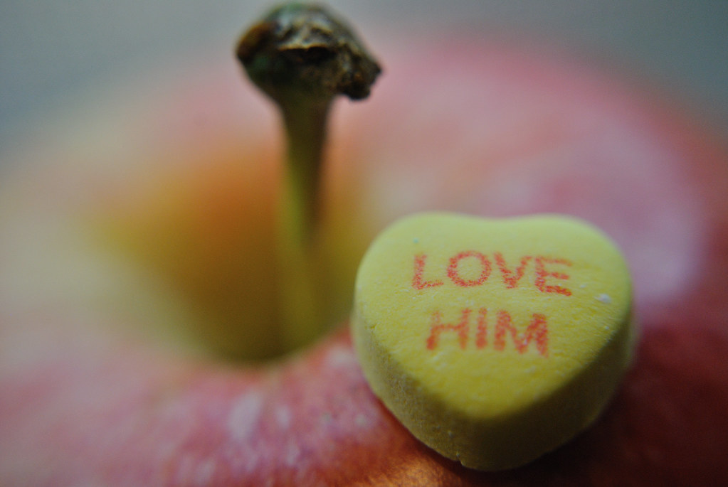
to {know him} is to {love him}
{Raw Edit}
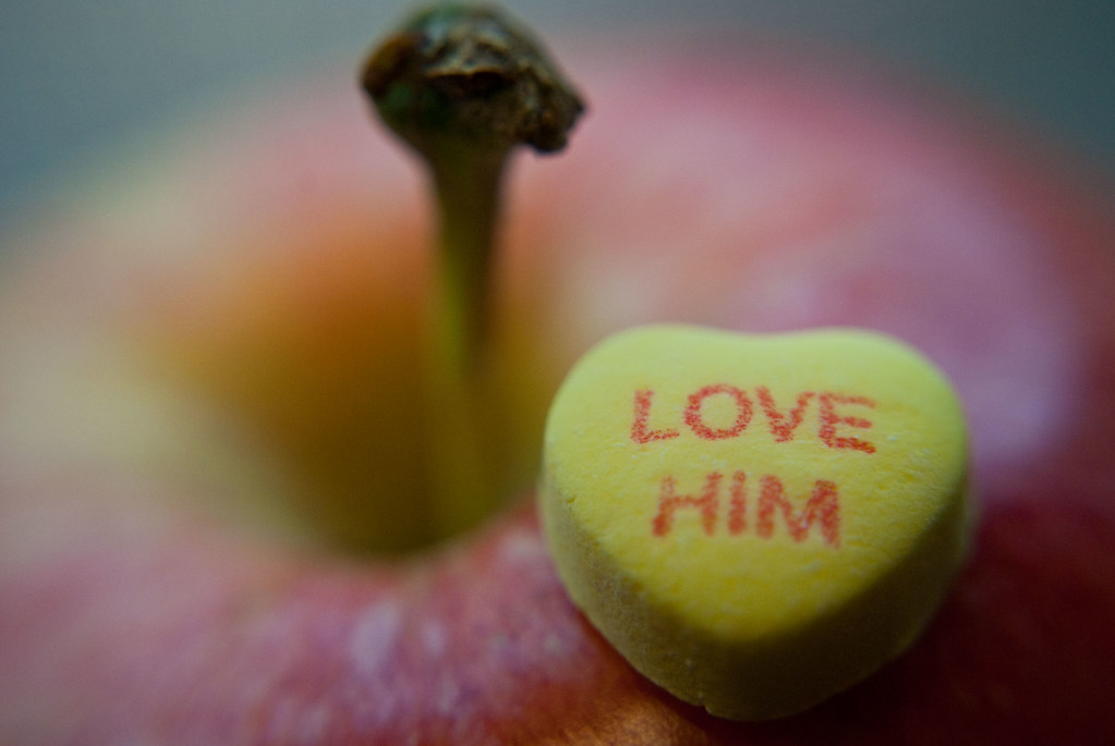
here is what i did in {Adobe Camera Raw}:
white balance: as shot
slight use of recovery
increased black light & brightness
increased clarity
increased saturation & vibrancy
once open from Raw, then used the healing brush
to remove any distracting spots on the hearts surface!
{Lustrous Edit}
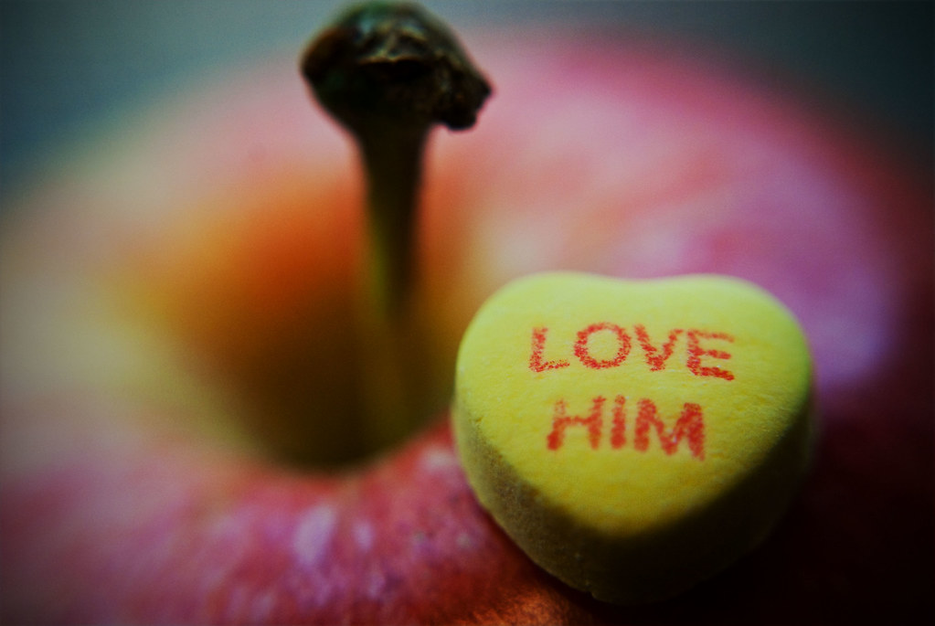
for Lustrous edit:
used Lustrous Pop to help bring out the beautiful shades of red,
a {free} action from The Coffeeshop Blog
once applied, decreased the color pop layer to 50%
but kept the sharpened layer at 100%
used hue/saturation to increase the {reds} just on background layer
next used the elliptical marquee tool; select {love him} & increased sharpness
once finished choose inverse select & applied a gaussian blur effect {twice} & used despeckle once
and last but not least, inserted some vignetting to draw your eye into the heart!
phew, finally... all finished!!!!!!!!!!!

though i do quite love my {SOOC} shot, i am OH! SO! IN LOVE! with my final {Lustrous} edit :) that action is just wonderful {not to mention FREE}
& with a bit of tweaking you can have those reds bouncing right off the page without a harsh over edit of the color!
{Flickr Edit}
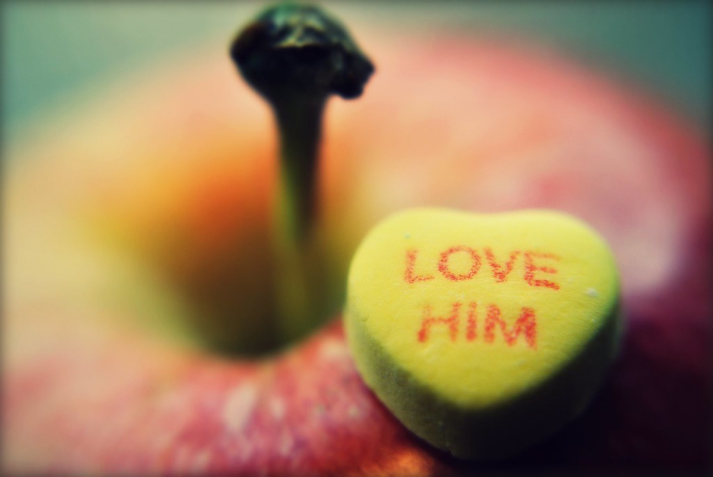
{a year living positively 19/365}
Ashley is encouraging texture use this week & since i already touched on that last week thought it would be nice with this edit to show everyone that you don't have to use PSE, CS5, Lightroom, or any other fancy/expensive program to get a great edited result. uploaded my {SOOC} shot into my Flickr account to solely edit the image in Picnik. notice that the spots on the heart are still there, you can upgrade your Picnik account in Flickr to offer features that will help eliminate those distractions. point is that a Flickr account & upgrade in Picnik are still cheaper to purchase than some Adobe editing systems, not to mention it is a very wonderful/helpful photography community to be involved in Ü

Second Shot {Optical Illusion}
{SOOC}
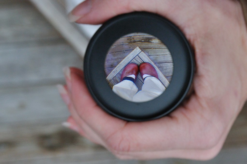
{Raw Edit}
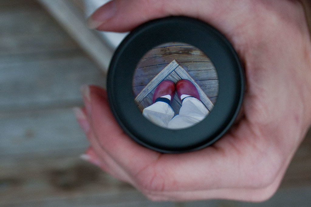
here is what i did in {Adobe Camera Raw}:
white balance: daylight
slight use of recovery
increased fill light & brightness
increased clarity
increased saturation & vibrancy
{Vermont Edit}
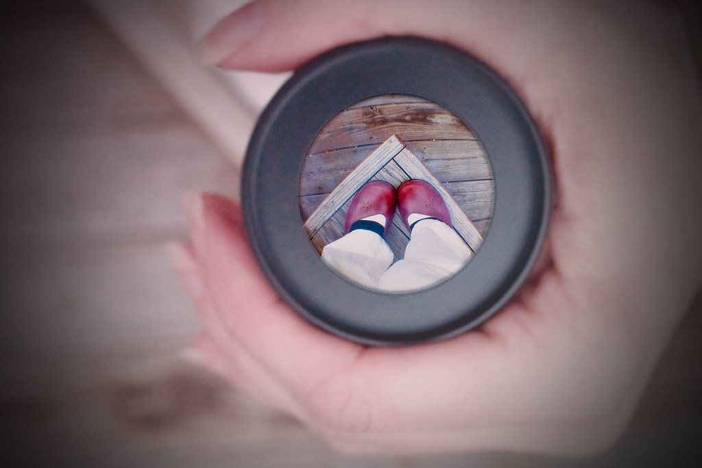
for my Vermont edit:
applied maple & cream layering to soften lighting
{not to mention take those wrinkles away from my hands, ewww!}
used hue/saturation to increase the {reds} just on background layer
next used the elliptical marquee tool; select within the circle & increased sharpness
once finished choose inverse select & applied a gaussian blur effect & used despeckle
and again added vignetting to draw your eye in!

{Flickr Edit}

here is my Flickr edit, used for Bench Monday! no prior editing on in Picnik :)
many of you asked on Tuesday how i achieved this effect...
well to be truthful it was much by accident with a bit of
experimenting thrown in!
you will need to have a {fish-eye} lens to achieve it:
lens comes apart in two sections
once apart you will notice that there is a larger convex lens that will bulge your image
and a smaller concave lens that {like the lens of your eye}
will flip images upside down, plus make objects seem extremely smaller than usual!
so there you have it, so simple, yet an awesome optical effect, now go grab your fish-eyes & start flipping the world upside down Ü

pop on over to Ashley's blog & link up for her part of Shoot & Edit...
& thanks for all the great/helpful tips Ashley & Jill!!!!
more shot & edit:

You Capture :: Red
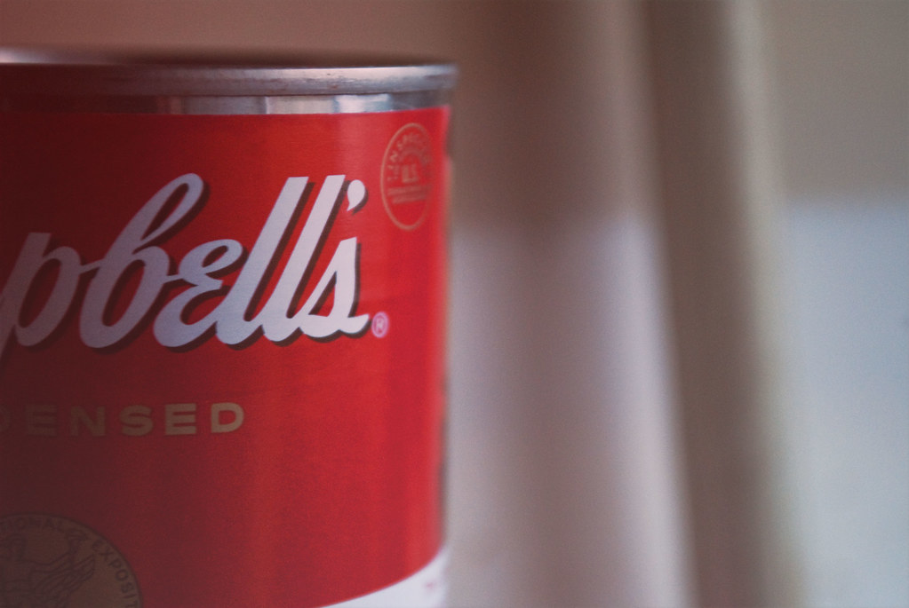
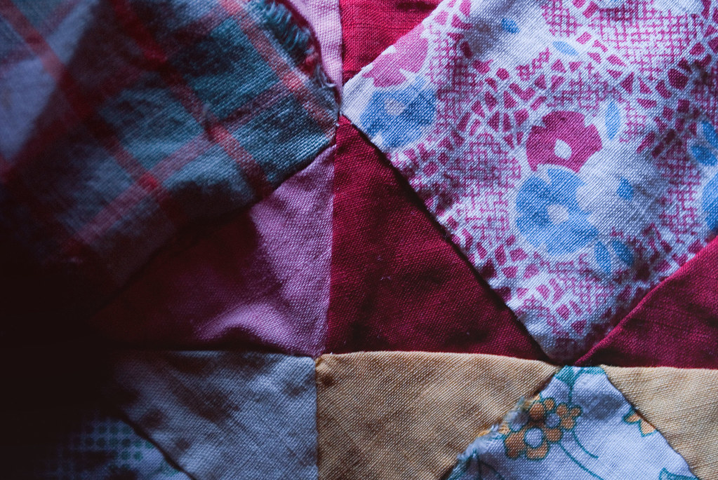
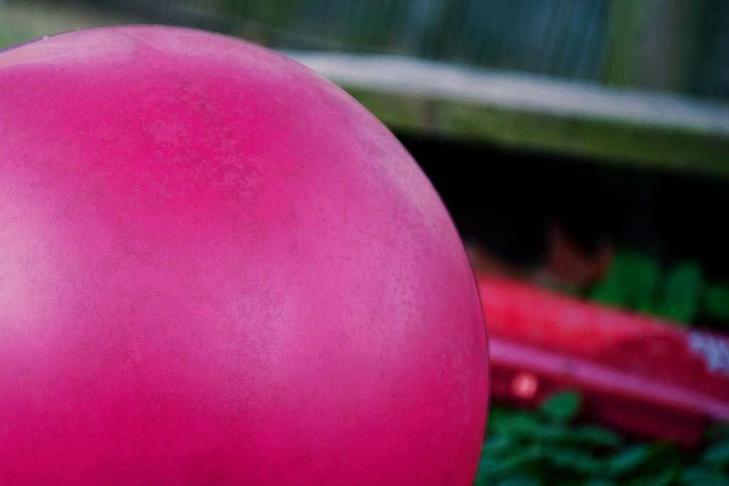
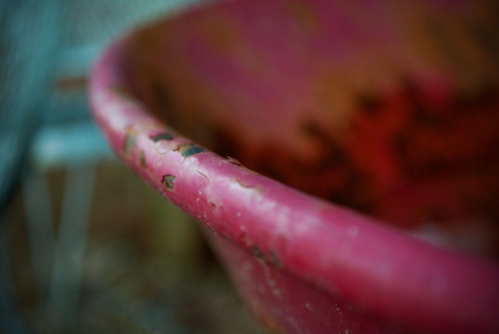
“so much depends upon a red wheel barrow glazed with rain water beside the white chickens.” ~W. Williams
this week's theme at I Should Be Folding Laundry
for You Capture is {red} too!
more red:

oh & if you didn't know ole Puxatony Phil
is predicting an early Spring this year... Hallelujah!
And Happy Chinese New Year {The Year of the Rabbit}
to those who are celebrating today!
Happy {Red} Thursday!




27 comments:
I love what you did this week! Great job :-) Love all the red shots too!
Wow- you did a lot! Cool! My fav would have to the shoes- so cute and creative.
I heart you - I love everything about this post and all your steps. I just oooohhhed and ahhhhhed over every image. And I never thought to do that with my fisheye. I will definitely have to try it. So glad you're back in blogworld again - I know I've said it before...but I really did miss you when you were away. You inspire me. :)
Ooo I love the 2nd picture.
These are all so good!! I really love your Vermont edit and your lustrous edit!
The second shot (where you can see your feet) is VERY, VERY cool! The apple/love him is also very unique and a fun capture!
Love the shoes! That's a fantastic and creative shot!
I love the lustrous edit on the first, and the vermont edit on the second. The flickr edit on the second created a some noise that distracted from the awesome creativity of this shot. :)
WONDERFUL edits! So creative and just fantabulous!
Very cool! Love that you posted all the steps.
And the shoe shot is so cool! :)
love the creativity of the apple shot. you have a great eye for composition
WOW, you turned great shots into AMAZING ones with your editing talent. Love this :D
Wow, such great shots!
Love the lustrous edit - it is gorgeous! And I love conversation hearts in photos!
These are just so beautiful - your optical illusion is sooooo good aswell.
Great editing! I'm still learning and have a ways to go.
Fabulous. F.A.B.U.LOUS!
Love the shot with your shoes & all of the edits! (I usually turn off blog music right away, but I'm really digging Imaginary Girl) :)
Your photography is truly amazing. I love what you did with this whole article! I love Picnik and got to work with a pro account for a month - it's very comparable to PSE!
Your edits are a whole other level of awesome. Great, great artwork!
Those are some great shots- makes me want to know more about each one.
Love your photos--all of them--but especially the illusion!
Great edits! I love them all. Wonderful red photos too.
Wow! Each one became a fav as I scrolled down. I love how you took the extra time to show us how great edits can be made with without ps!
My fav out of all of these is your first apple series! Love them and may have to use that as an inspiration someday, if you don't mind!
You are SO creative, Christine! LOVE those edits. Wow.
Wow, these were so much fun to look through, thanks for sharing all the "how to's"!! I love that vermont edit... and the lusterous one too. How fun! :)
~Tabitha
i love to watch how people process the image it's so inspiring ..
you have done a great great job...waiting for more :))
Great shots! I love the edits you did. That first shot really came to life!
Post a Comment